|
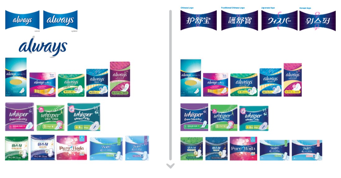
ALWAYS BRAND
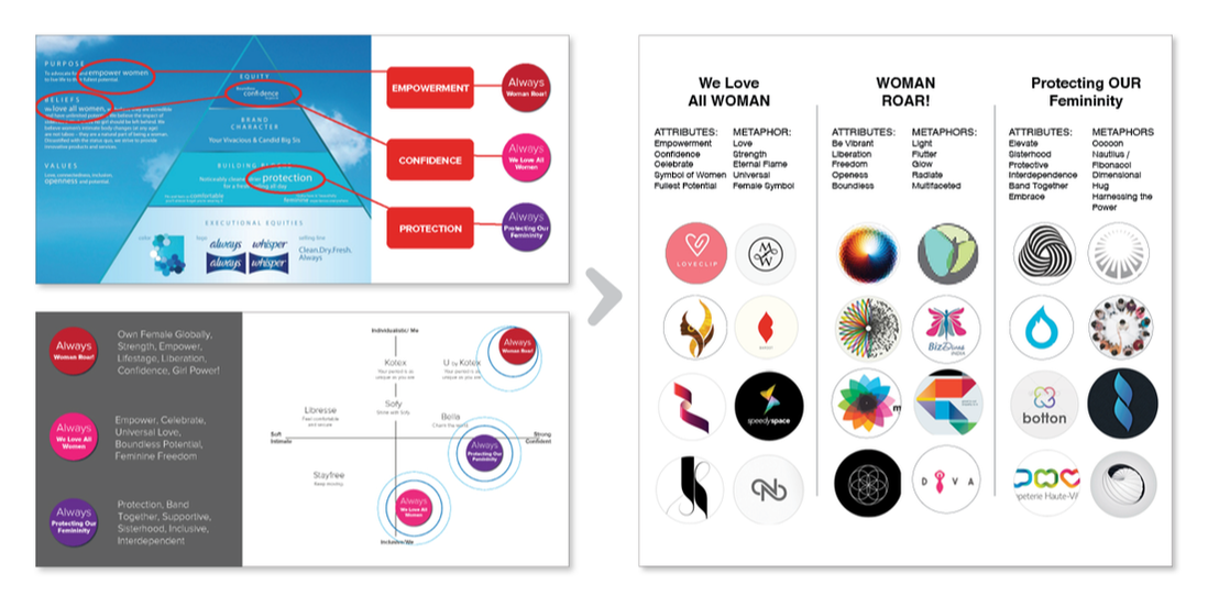
ICONIC BRANDING Creative Direction LPK, 2013-2015 PHASE I CHALLENGE: Create iconic brand assets for Always. The mark must represent the Always brand equity, translate globally, and proliferate an asset toolbox for all consumer touchpoints. Gain inspiration from equity and continued with word association to gather attributes and metaphors to begin exploration. Design a global ‘vision’ package system for the Always brand, assume fit to brand equity and targets in all regions. Synchronize the BOP and wordmark globally and prioritize the color blue as the brand’s consistent ownable asset. VISION PACKAGE DESIGN
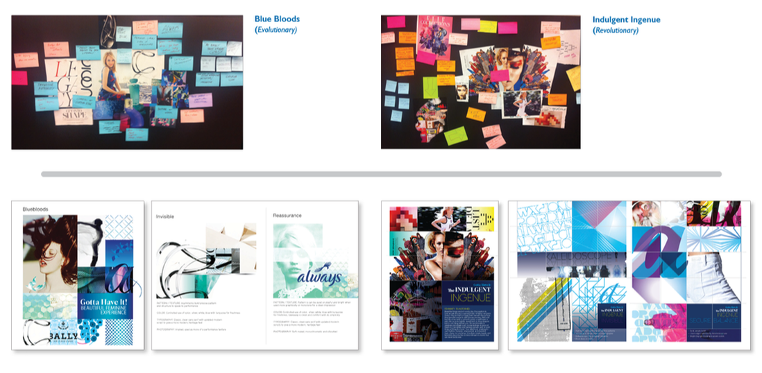
PHASE II CHALLENGE: Vision package inspirational workshop to kick-off the package design phase. Design spectrum of evolutionary to revolutionary, focused on top 2 pillars. OUTCOME:
Spectrum of vision package designs, delivering potential to unify with brand assets, bring updated brand story to life, as well as project into a new POME space. OUTCOME:
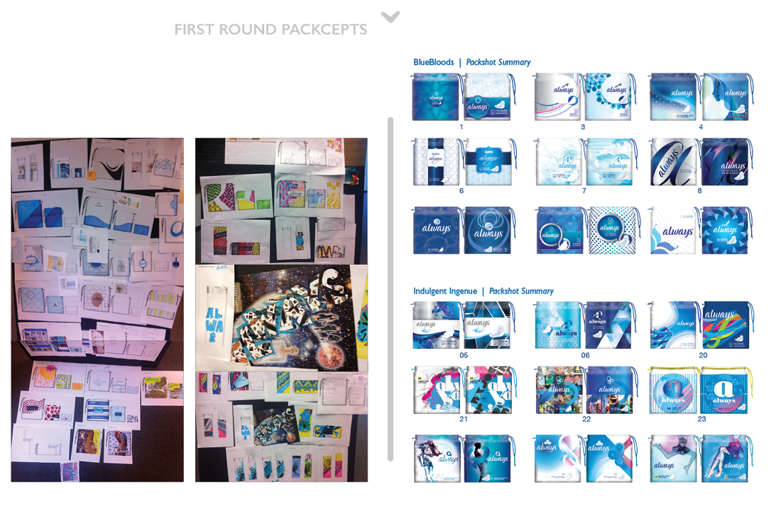
Second Round - narrowed 3 concept to share with client that met the success criteria: connection to global equity. PHASE III PROCESS:
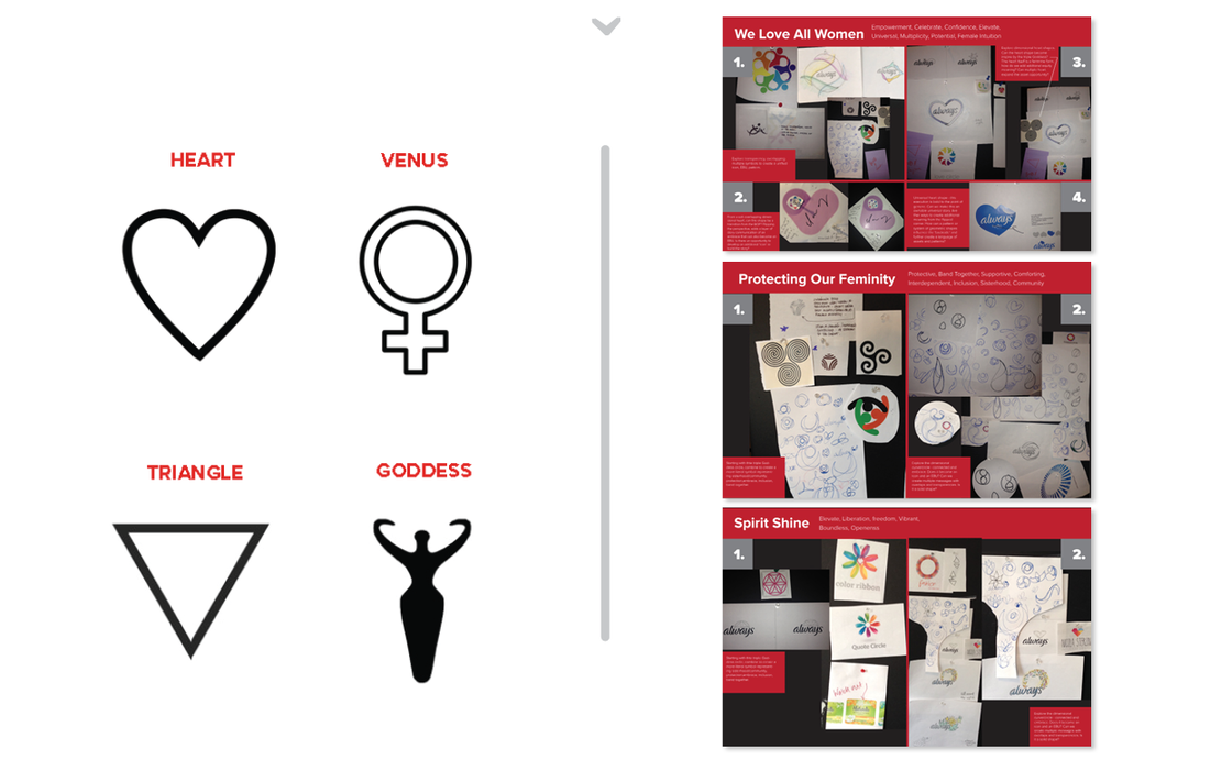
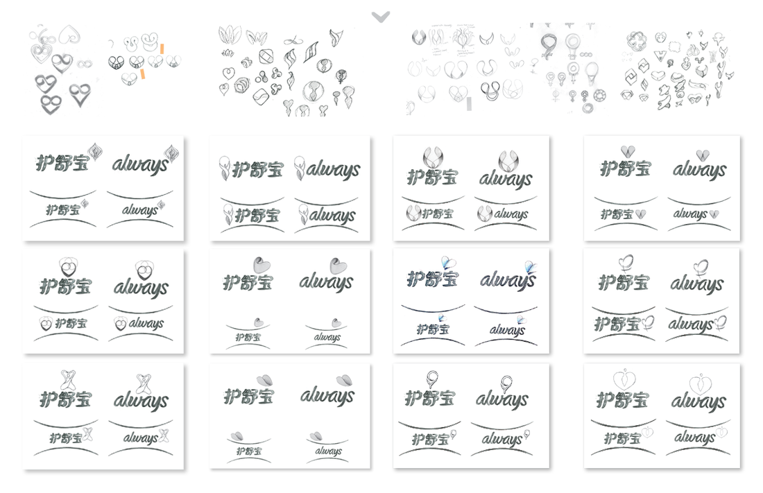
Utliilize design teams in Singapore, Cincinnati, as well as freelancers in NYC and Columbus. Shared passion for unrealized ideas, pulls, and sketches. Narrowed ideas per pathway to refine and focus executions. Further semiotics research provided a narrowed range to regain strategic focus for final rounds. Sketch and refinement phase in context of BOP structure (on pack EBU) as well as developing logo lock-up placement. OUTCOME:
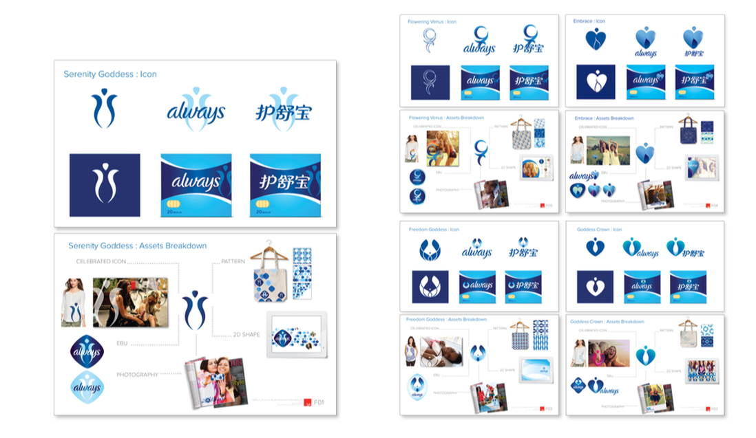
Presented to internal Design function. P&G Head of Design, Phil Duncan said, “Someone finally solved it!” Emily Kokenge (Head of Fem & Baby Design), “This is truly iconic branding work and I don’t know which one I would recommend because they are all great.” |
|
|
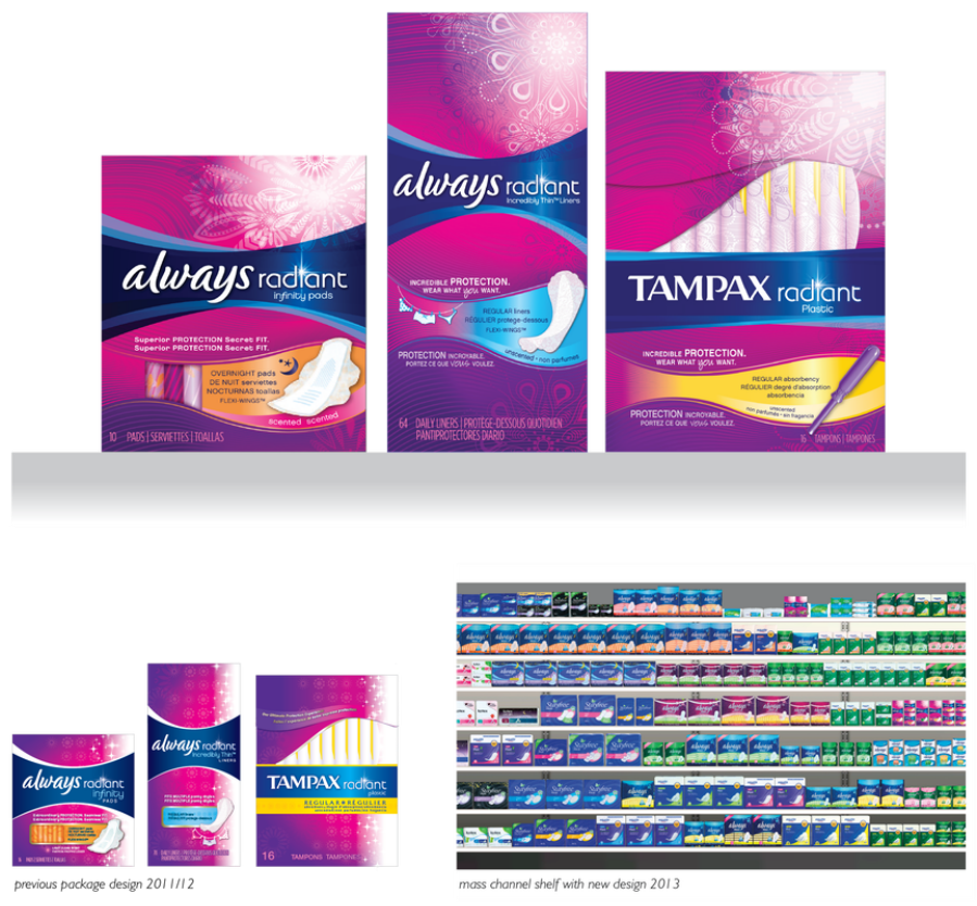
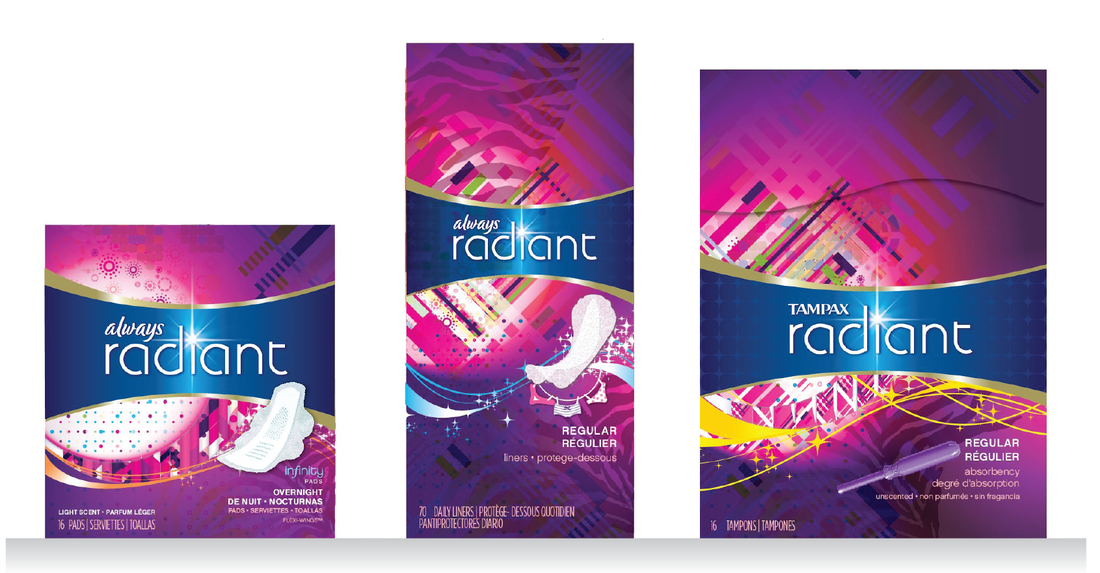
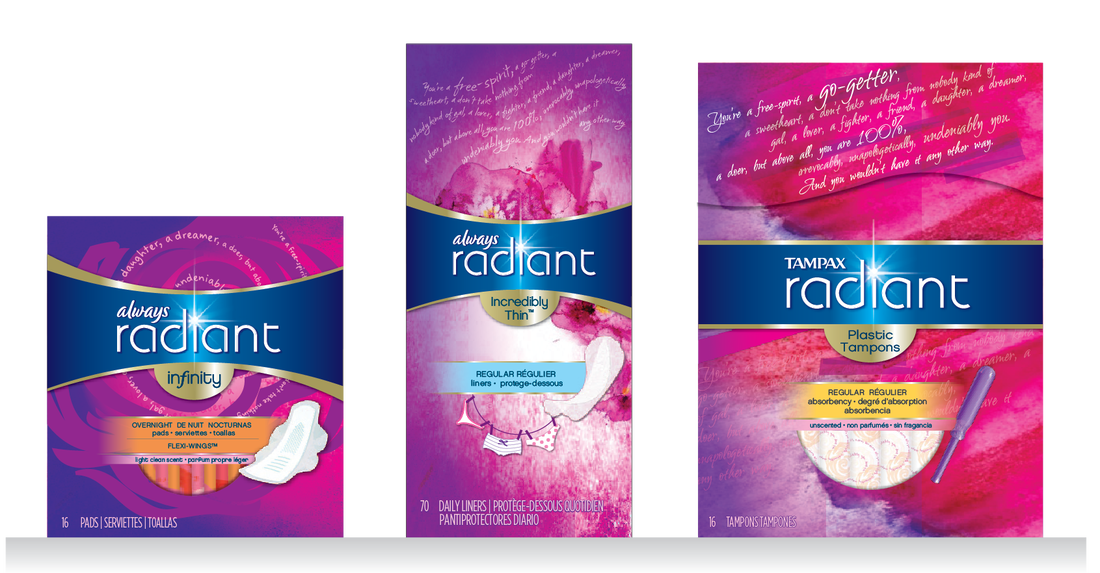
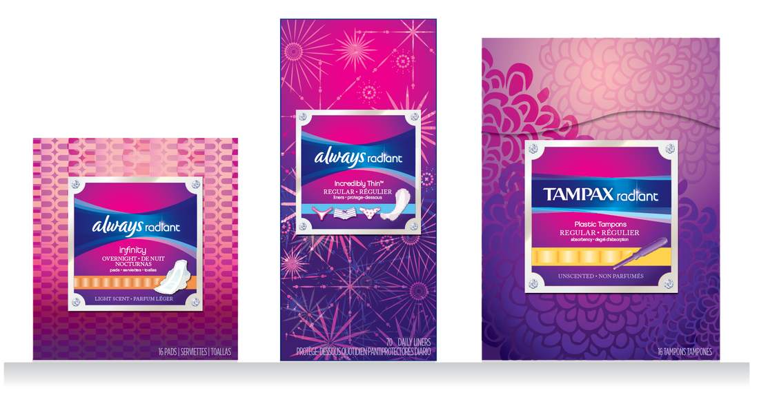
Always Radiant Collection
NA (North America) Creative Direction LPK, 2012 The Radiant Collection of products speak to the target audience of younger woman that like to look and feel fabulous. The updated design keeps the package fresh and fashionable, eye-catching and relevant to this consumer. |
|
|
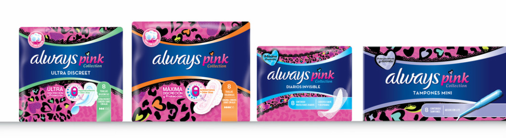
Always Pink Upgrade
LA (Latin America) Creative Direction LPK, 2013 The Pink Collection is a line-up of feminine care products targeted at girls aged 8-18. |
|

previous package design 2013
|
|
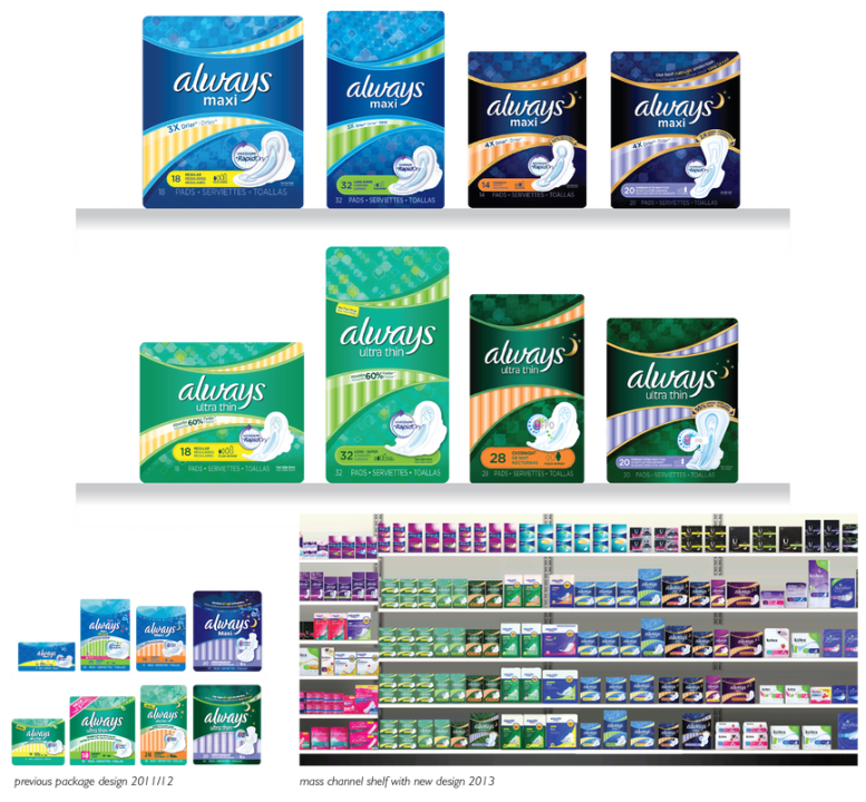
Always Mainline Upgrade
NA (North America) Creative Direction LPK, 2012 Upgraded layout to optimize the window shape to incorporate the EBU and communicate movement. The new contemporized package utilized pattern in the background to add a dimension and depth. |
|
|
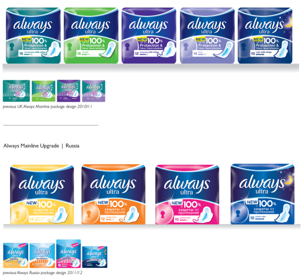
Always Mainline Upgrade
WE & CEEMEA Creative Direction LPK, 2013 Upgraded package to clean-up branding and incorporate marketing communication into the package design. Modern typography block and iconic lock provides shelf impact and gain noticability in the cluttered feminine care aisle of these regions. |
|
|
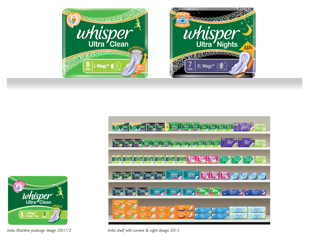
Whisper Special Edition
India Creative Direction LPK, 2013 This special edition pack celebrates the Henna tattoo synonomous with this part of the world. The detailed graphics surrounding the EBU, frame the brandmark and highlight the character of the region. |
|
|
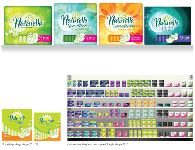
Naturella Mainline Upgrade
LA & CEEMEA Creative Direction LPK, 2012 The Naturella brand is targeted at women that want a more natural feminine care expereince. The mainline product provides the scent of chamomile for a soothing experience. With this launch, there are add offerings of Green Tea and Calendula scented products as well as a Night time use offereing. The EBU has been updated with an evolved logomark. |
|
|
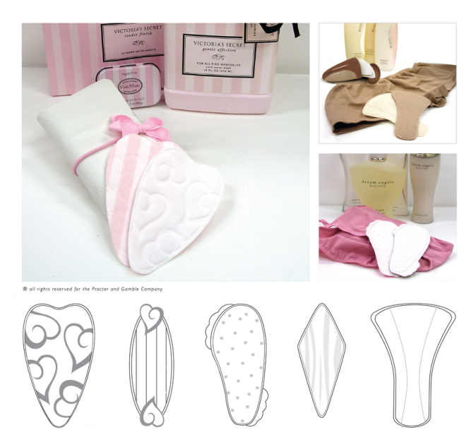
Victoria Secret Liners Licensing Concept
Design Management P&G, 2004 Utilizing ultra thin pantyliners, we created products that fit within the Victoria Secret current architecture of consumer offerings. The concept of Protecting your Lingerie. Leading the strategy and creation of the prototypes, I was able to create forms that became invisible once placed into the panty. Designed and prototyped in house. |
|